
Making data tell the story
In 2 weeks' time, I'm doing a workshop on making awesome visualisations using LLM. Here is a nice quick exmaple

So Liverpool are about to sign a new winger named Victor Muñoz, who currently plays for Osasuna in Spain. He is supposed to be capable of playing across the front line, and seems to be known for his dribbles (he’s in the Spanish squad at the ongoing FIFA World Cup, but was an unused sub in the draw against Cabo Verde).
I was looking through the Liverpool subreddit, and someone had pasted these two tables, to show Muñoz’s attempted dribbles and successful dribbles, and how it stacks up against the rest of the league.
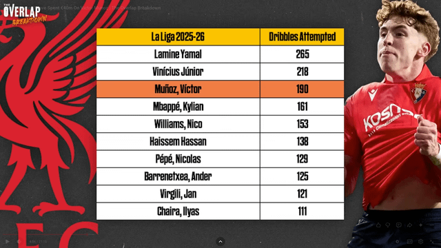
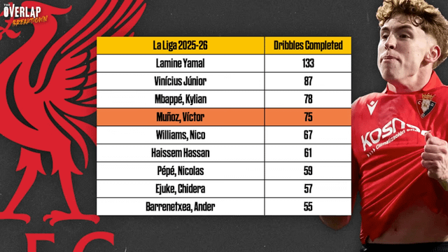
Now the problem with two tables like this (and to see them in Reddit, you need to keep going back and forth, and not have both in the picture at the same time) is that it is almost impossible to compare. And so I quickly copy pasted both of them and put it in Claude, and in a couple of iterations, it had created this rather nice visualisation for me:
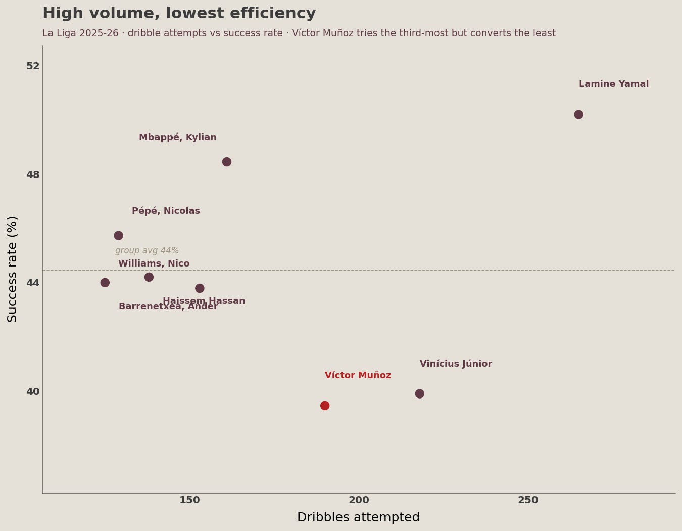
This scatter plot makes the picture much more clearer - Muñoz is among the biggest dribblers in La Liga, but the least good at it (among those who dribble a lot). That said, this graph puts him somewhere in a similar league to Real Madrid star Vinicius Junior, and that is not that bad a thing!
You might think that this graph doesn’t look like the average graph that Claude might produce, and that’s because it’s used (an old version of) my data visualisation skill (yes I’ve put it on Github so everyone can use it! And it’s MIT licensed, so you can use it in your production code as well).
Also this illustrates a good example of how choice of graph and data representation can go a long way in terms of conveying the information effectively. For example, if we look at the original two tables presented, all that we know about Muñoz is that he attempts a lot of dribbles and completes a lot of dribbles. That is good information, but not complete. The graph here, though, shows up his inefficiency in completion.
Within the realms of data science, data visualisation is sometimes underappreciated. However, sometimes when you visualise the data well, it can tell a lot of stories that you wouldn’t have otherwise imagined.
In two weeks’ time, at an awesome (and awesomely named) conference called VizChitra, I’ll be doing a workshop on how to consistently make good data visualisations using LLMs. This is a 3 hour hands-on paid session (you’ll bring along your computer, dataset and LLM, and making a bunch of visuals), and you can find tickets for it here.
Note for myself: next, I should create a “chart picker skill” based on all the charts that I’ve built over the years. Given the data and the story that you want to tell, pick the best possible chart. This time I had to prompt Claude on precisely what metrics to show.